CSS 中的 outline 属性用于在元素周围绘制一条轮廓线,位于边框之外,这条线与border属性所定义的边框不同,它不占用盒子模型CSS基础:盒子模型详解,因此不会影响页面的排版,也不会影响元素的可点击区域。
它的作用如下:
ok,那我们一起来看一看吧。
outline相关的属性主要包括以下 3 个。
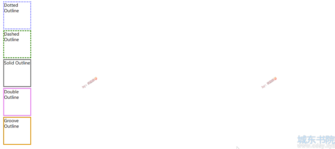
1. outline-style - 定义轮廓线的样式。
2. outline-width - 定义轮廓线的粗细。
3. outline-color - 定义轮廓线的颜色。
代码如下:
- <!DOCTYPE html>
- <html lang="en">
- <head>
- <meta charset="UTF-8" />
- <title>Outline Style Examples</title>
- <style>
- .outline-dotted {
- outline-style: dotted;
- outline-color: #0000ff;
- }
-
- .outline-dashed {
- outline-style: dashed;
- outline-color: #008000;
- }
-
- .outline-solid {
- outline-style: solid;
- outline-color: #666;
- }
-
- .outline-double {
- outline-style: double;
- outline-color: rgb(217, 29, 217);
- }
-
- .outline-groove {
- outline-style: groove;
- outline-color: orange;
- }
-
- .example-box {
- width: 100px;
- height: 100px;
- margin: 10px;
- outline-width: 3px;
- }
- </style>
- </head>
- <body>
- <div class="example-box outline-dotted">Dotted Outline</div>
- <div class="example-box outline-dashed">Dashed Outline</div>
- <div class="example-box outline-solid">Solid Outline</div>
- <div class="example-box outline-double">Double Outline</div>
- <div class="example-box outline-groove">Groove Outline</div>
- </body>
- </html>
-
效果如下:
为了简写代码,outline 也可以针对以上 3 个属性简写。简写的顺序无关紧要。我比较习惯的是按照 border 的写法:outline-width(宽度), outline-style(样式),outline-color(颜色) 。
注意:在简写中,至少必须包含轮廓样式 outline-style 属性,其他 2 个属性可选。
下面是一个简写的示例:
- .example {
- outline: #0ff solid 5px; /* 将轮廓设置为青色的实线,宽度为5像素 */
- }
-
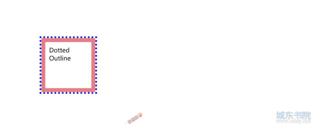
outline 是在盒子模型的 border 之外绘制的一条线,而outline-offset 允许你控制这条线与 border 之间的距离。比如,下列代码,我们同时设置了 padding,margin,border。
- <!DOCTYPE html>
- <html lang="en">
- <head>
- <meta charset="UTF-8" />
- <title>Outline Style Examples</title>
- <style>
- .outline {
- width: 100px;
- height: 100px;
- border: 10px solid #ef7e84; /* 西瓜红色的边框 */
- padding: 10px;
- margin: 100px;
- outline: 5px #00f dotted; /* 蓝色的轮廓 */
- }
- </style>
- </head>
- <body>
- <div class="outline">Dotted Outline</div>
- </body>
- </html>
-
-
效果如图,可以很明显看出 outline 是紧贴着 border 的,也意味着默认偏移值是 0。
以下是 outline-offset 的特性:
好,我们现在根据刚才的案例,增加一个负值的偏移:
- <style>
- .outline {
- width: 100px;
- height: 100px;
- border: 10px solid #ef7e84; /* 西瓜红色的边框 */
- padding: 10px;
- margin: 100px;
- outline: 5px #00f dotted; /* 蓝色的轮廓 */
- outline-offset: -10px; /* 轮廓向内偏移-10px */
- }
- </style>
-
-
效果如图。
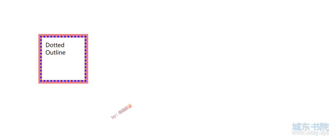
可以看 它跑到padding上面了~其他的偏移值可以自己试一下。


 湘公网安备 43102202000103号